


 Your new post is loading...


From
mashable
Ever wonder what it would look like to plot every single geotagged tweet since 2009 on a map? Twitter has done just that.
Twitter posted these maps of Europe, New York City, Tokyo and Istanbul on its blog Friday. They use billions of geotagged tweets: Every dot represents a tweet, with the brighter colors showing a higher concentration of tweets. It's pretty amazing how the mapped-out tweets clearly match with population centers, highways and the like — though perhaps that's obvious.
Via Lauren Moss, Neil Ferree

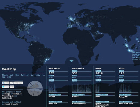


Some smart guy said Twitter is not a Technology • It's a Conversation and will ocurr with or without you and knowing where the conversation is happening can be very useful to online marketers who use Twitter
Unit 1 Nature and Perspectives of Geography. This is a map of all of the geotagged twitter posts from 2009 to now in the United States. Its shows population distribution and points of interest that people like to travel to. It shows dense population centers and highways. You can see the roads in the map because of space in the map not covered. The brighter colors are in higher population and more popular travel destinations. This is a map of many types. This map is a part of unit 1 because it is a map of a basic geographic concept. This map is a functional map of sorts because it shows points of travel that people go to, but it is not varied by distance so it is not a precise version. This map is a definite example of a thematic map because it shows the story of the travel destinations of five years of their lives.